MOBILE WEB
Open a website on your phone and ‘right-click’ any link.
There is a reason why you can’t. Unlike desktop computers, phones and other mobile devices don’t do point-and-click. For the first time it has become necessary to design differently from what we’ve been doing ever since the Web came into existence. Users are increasingly using mobile to browse the web; for that matter, people are doing almost everything from browsing to booking, commerce to conversations, research to rants, and talking to teaching on their phones. Are your web sites and applications ready for the changed contexts?
Responsive Design
“Everything is changing and it happened one night.” These lyrics of one of Cliff Richards’s hits are almost prophetic when it comes to the way information is being consumed. Lots of this vs. that going on in tech circles, especially when mobile is the topic. Native vs. HTML5, WAP vs. Hybrid, etc.
Wikipedia –
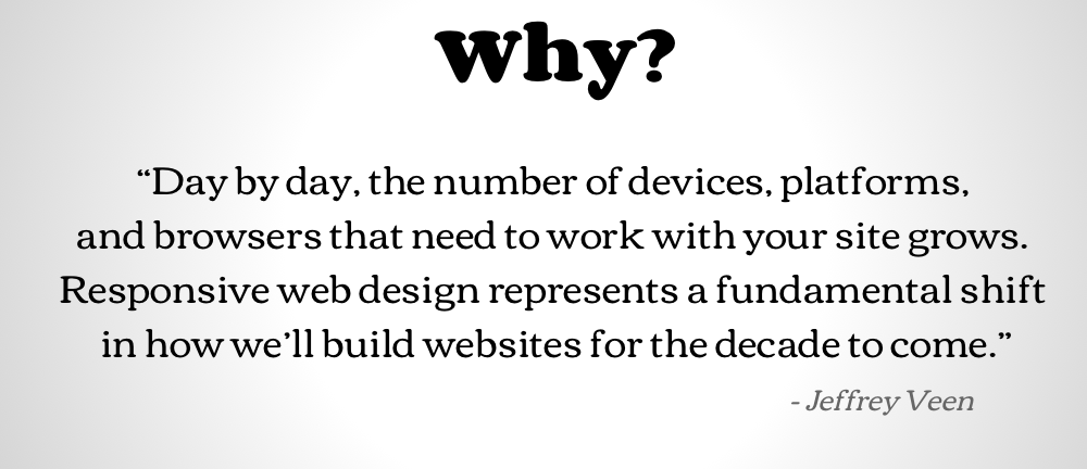
Responsive web design is a web design approach aimed at crafting sites to provide an optimal viewing experience “easy reading and navigation with a minimum of resizing, panning, and scrolling”across a wide range of devices.
What the heck is Responsive Web Design? John Polacek demystifies
We’re happy to help you figure out which way your web strategy should be headed.
